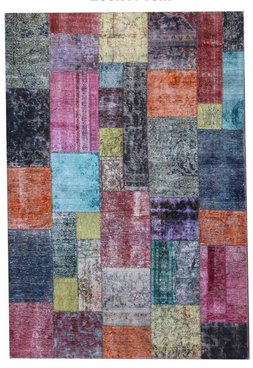
Turquoise panels bring a cool brightness to this rug, set among coral, rose, dark blue and grey. Small pale yellow sections add further points of contrast. Some rectangles are long and narrow, others almost square, and their staggered placement creates a lively arrangement without a central medallion. This rug would make a useful starting point for a room with several existing colours. The blue and grey could relate to a sofa, while coral or pink could be taken up in a smaller upholstered piece. At 171 by 239 centimetres, its proportions suit a modest seating area.
An open-based table would leave the varied central panels visible rather than hiding the strongest colour relationships. The patchwork keeps traces of floral drawing within a thoroughly contemporary framework. Here the curved floral traces contrast with the straight boundaries of the coloured panels. In this example, those qualities are present at different scales: the panel boundaries establish the larger structure, while small curls and flower fragments occupy individual coloured pieces.
Differences in the clarity of that drawing give this rug further variation across its surface. The turquoise is especially effective where it meets orange or dark blue, creating brief moments of stronger contrast. Elsewhere, softer rose and grey sections allow the composition to settle. This balance between vivid accents and quieter intervals gives this rug a more considered character than its many colours might initially suggest.