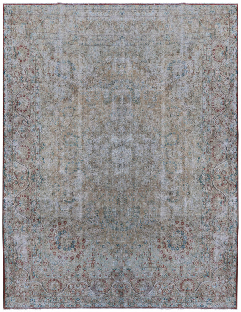
Pale blue and cream give this rug an airy appearance, while soft rose and grey outlines carry its floral ornament. Broad curved forms are visible near the corners, with smaller details spreading into the field. The contrast is deliberately quiet in effect: some lines remain distinct, while others seem to dissolve into the lighter background. This makes the surface feel spacious despite its underlying intricacy. The borders continue that lightness. Fine divisions and softly drawn pattern surround the centre without introducing a heavy dark edge.
Subtle changes in tone create gentle horizontal movement beneath the ornament. Rather than concentrating attention on one strongly marked medallion, the rug invites a slower reading of its curves, intervals and faint connections. Within Persian carpet history, floral compositions have used both central arrangements and enclosing frames to create order. Even when a palette becomes very subdued, the relationship between field, corner drawing and border can remain perceptible.
This vintage Persian overdyed example draws its structure from that wider design tradition. Its pale colouring should not be taken as evidence for a specific age, condition or weaving location. A room with soft plaster tones, pale wood and linen-like fabrics would allow these quieter colours to settle naturally. Darker furniture could also provide a clear silhouette against the light ground. Leave a generous area uncovered wherever possible, so the delicate corner curves and border do not become mere fragments beneath larger pieces.